

Large malls, hospitals, campuses, hotels, and office buildings can be difficult to navigate even when you have visited them before. Now imagine facing unclear signs, inaccessible routes, crowded corridors, or digital maps you cannot use. Would you know where to go? Would you feel comfortable returning?
The World Health Organization states that 1.3 billion people, or 16% of the global population, experience significant disability.
That makes indoor accessibility a practical business issue, not a niche concern. Below are six ways businesses can make complex indoor spaces easier to understand, navigate, and use without attempting to redesign the entire building at once.
Here’s What’s Inside
Improving accessibility across a complicated building is rarely about installing one ramp or replacing a few signs. Visitors experience the building as a journey, so accessibility needs to work from the entrance to the final destination.
The most useful improvements usually involve several areas working together:
- clear and unobstructed accessible routes;
- indoor maps and wayfinding that account for different mobility needs;
- signs that remain easy to identify at important decision points;
- information delivered in formats more people can use;
- accessible websites, apps, kiosks, and digital maps;
- staff who understand accessible routes and alternative options.
Here’s the thing: each feature may work perfectly on its own while the overall journey still fails. The real goal is to remove the moments when visitors become stuck, uncertain, or unnecessarily dependent on someone else for directions.
1. Test Accessibility as a Complete Visitor Journey

Start by walking through the building as a visitor would, rather than auditing individual features in isolation. Follow common journeys such as parking area to reception, entrance to elevator, elevator to restroom, or lobby to a particular store or office.
Then look for the places where that journey breaks down.
Can someone using a wheelchair reach the destination without encountering stairs? Does the accessible entrance require a long, poorly marked detour? Are doors, counters, or elevators easy to approach? Are temporary displays narrowing routes?
For businesses in the United States, ADA Title III covers many businesses open to the public and includes requirements involving accessible routes, entrances, doors, service areas, and other building features.
Regulations vary by country, but the practical principle travels well: audit the complete route people actually use, not simply whether individual accessible features exist.
2. Add Indoor Wayfinding for Large and Multi-Floor Buildings
Static directories can tell visitors where a destination is, but they do not necessarily explain how to reach it. That distinction becomes important in shopping centers, hospitals, airports, and campuses where the appropriate route may change depending on mobility needs.
A modern indoor positioning system for shopping malls can connect indoor maps with location-aware navigation, helping shoppers understand their position and follow directions across floors and different parts of a venue.
Visioglobe describes indoor mapping as interactive navigation that can operate through smartphones and kiosks, while its accessibility features include adapted routing for different mobility requirements.
That can help users find:
- elevators instead of stairs;
- accessible entrances and restrooms;
- customer-service points;
- specific stores, rooms, or departments.
Digital wayfinding should complement physical signs, not replace them. Visitors still need workable directions if they do not have a smartphone or prefer not to use one.
3. Keep Accessible Routes Clear After the Building Opens
A building may meet accessibility requirements when it opens and become harder to use later because everyday operations change the space. Promotional stands appear in corridors. Delivery carts wait near elevators. Furniture moves. Temporary queues block convenient routes.
That is why accessibility needs routine maintenance.
| Area to Check | Common Problem | Practical Action |
| Entrances | Accessible door is difficult to identify | Add clear directions from the main approach |
| Corridors | Displays or furniture reduce usable space | Include routes in daily floor checks |
| Elevators | Access is blocked by queues or equipment | Maintain clear approach areas |
| Restrooms | Accessible features become storage space | Add them to facility inspections |
| Service points | Visitors cannot comfortably approach | Review furniture and queue layouts |
ADA guidance treats an accessible route as a connected path serving accessible elements and spaces, rather than a collection of unrelated features.
The practical takeaway is simple: accessibility is an operating responsibility as well as a design responsibility.
4. Make Signs and Directions Easier to Understand
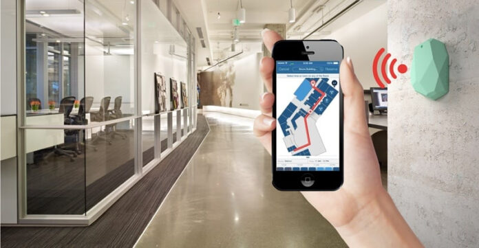
Good indoor wayfinding should answer three questions quickly: Where am I? Where is my destination? Which direction should I take next?
Signs become confusing when terminology changes between floors, arrows are difficult to notice, or too much information competes for attention. Keep destination names consistent across directories, wall signs, kiosks, and digital maps. If the map says “Customer Service,” a nearby sign should not suddenly call the same destination “Information Desk.”
For U.S. facilities covered by the relevant standards, the U.S. Access Board explains that directional and informational signs must meet applicable visual requirements, while certain signs identifying permanent rooms and spaces have tactile requirements as well.
Useful design priorities include:
- strong contrast between characters and backgrounds;
- readable type at appropriate sizes;
- familiar symbols;
- logical placement at decision points;
- tactile information where standards require it.
More signs are not always better. A smaller number of well-positioned, consistent signs can be easier to follow than a corridor full of competing messages.
5. Communicate Important Information in More Than One Way
Navigation is not only about arrows on walls. Visitors may also need opening information, queue instructions, service announcements, emergency messages, or help when a route changes.
Relying entirely on sound can exclude people who are deaf or hard of hearing. Relying entirely on visual information can create barriers for people who are blind or have low vision.
ADA guidance on effective communication explains that businesses serving the public must communicate effectively with people who have communication disabilities, and that the appropriate method depends on the nature, length, complexity, and context of the communication.
In practice, businesses might combine:
- spoken announcements with visual information;
- clear printed directions with staff assistance;
- captions for relevant video content;
- tactile information where appropriate;
- digital information compatible with assistive technology.
Useful principle: The ADA describes the goal as finding a communication solution that fits the circumstances.
The format should match the information being communicated rather than forcing every visitor through the same channel.
6. Make Digital Maps, Apps, and Kiosks Accessible
Moving a directory from a wall onto a touchscreen does not automatically improve accessibility. A visitor may still struggle if buttons are tiny, text has poor contrast, functions depend on precise tapping, or navigation cannot be controlled without a mouse or touchscreen gesture.
Accessibility should therefore be part of digital procurement from the beginning.
W3C’s Web Content Accessibility Guidelines, WCAG 2.2, provide widely used guidance for making digital content more perceivable, operable, understandable, and robust. Among other requirements, WCAG covers keyboard accessibility, contrast, resizing text, navigation, and input methods.
Before launching an indoor navigation platform or visitor kiosk, check whether users can:
- navigate controls without relying on a mouse;
- identify buttons and destinations clearly;
- enlarge information without losing functionality;
- understand what happens after selecting a route;
- recover easily after choosing the wrong destination.
The good news? These improvements often make digital tools easier for everyone, including people using a kiosk in bright light, carrying bags, or navigating an unfamiliar building for the first time.
7. Train Staff and Include Accessibility in Emergency Planning
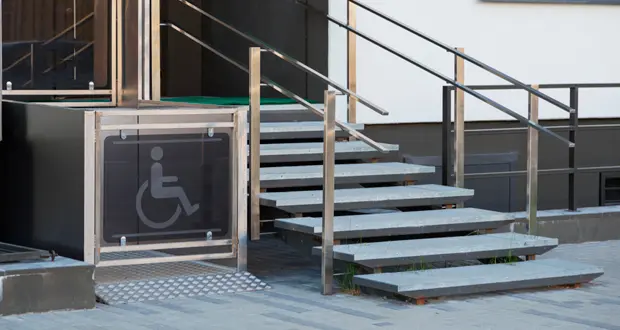
Even excellent indoor navigation cannot cover every situation. Elevators break down. Departments move temporarily. Entrances close. Visitors may simply prefer speaking with someone.
Front-line employees should know the accessible routes through the building and understand the alternatives when the normal route is unavailable. Staff should also know where accessible restrooms, entrances, service points, and elevators are located rather than guessing when someone asks.
Emergency procedures need the same attention.
ADA emergency-planning guidance notes that different warning methods reach different people. Someone who is deaf may not hear an audible warning, while someone who is blind or has low vision may not notice a visual signal. The guidance recommends using multiple forms of notification rather than depending on one method alone.
Businesses should test:
- how visitors receive emergency information;
- what happens when normal accessible routes are unavailable;
- whether staff know alternative procedures;
- whether visual and audible warning systems reach the people who need them.
Accessibility should still work when conditions are less than ideal.
Start With the Biggest Accessibility Barriers First
Making a complex indoor space easier to use does not require changing everything tomorrow. Start with the places where visitors are most likely to lose their way or encounter unnecessary barriers.
Walk through key routes. Fix unclear signs. Keep accessible paths clear. Improve indoor navigation where the building is too complicated for static directories alone. Then review digital tools, communication methods, staff knowledge, and emergency procedures.
Most importantly, test changes with people who actually use the space.
Indoor accessibility works best when physical design, information, technology, and staff support reinforce one another. Pick one or two manageable improvements first, measure what changes, and build from there. A building becomes genuinely easier to navigate through consistent improvements, not one impressive accessibility feature surrounded by avoidable barriers.