
Even though it doesn’t seem so at first glance, product labels are a vital part of the overall packaging design. They can easily set your merchandise aside, attract new customers, and, therefore, boost your revenue. You don’t have to create one only when you are getting ready to launch your products. You also have to design new ones occasionally, when implementing a new marketing strategy, to freshen up your goods.
Now, the designing process can prove to be challenging. It is so much more than simply choosing colors, font, and printing them. There are several things to consider, so we have come up with a step-by-step guide for you to follow.
1. Who are your customers?

This is the first and most important question you need to answer. It will dictate the entire process, and you will make all the vital decisions based on this information. Why is this important? Well, if you know your buyers very well, you will understand what they look for in a product and know exactly what to offer.
There is a significant difference between young adults and older people. They surely won’t be attracted by the same design. Make sure to research them via surveys and questionnaires and draw conclusions regarding their likes and dislikes, the colors they prefer, the reason they buy your product, and why they choose you over your competitor. This information is vital, and you will see how easier the entire process will be.
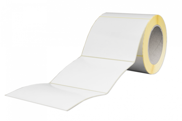
2. Consider label material
Not many people think about this, but it is one of the initial choices you have to make. What type of product do you offer? Do you sell natural products? You can choose a label material to reflect this. What’s more, the brown kraft one will attract people looking for organic products, and it will be very easy for them to decide to buy it since they won’t have to read the content carefully.
On the other hand, if you sell bath salts and bath bombs, you need to go with a material that can resist water and moisture. Not only may the packaging be in direct contact with water, but shoppers will probably keep it in the bathroom, where it will be exposed to almost constant moisture.
3. Choose the size
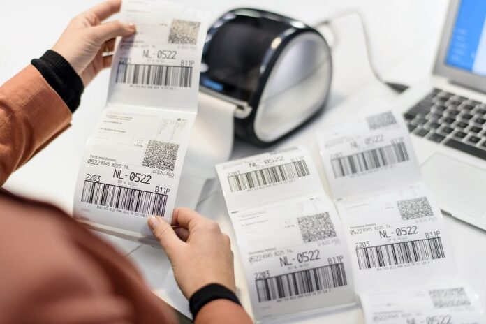
Yes, you also need to pick the size of the label before you start working on the design. If you don’t do this, you may end up with a design that is too big or too small. Once again, there are several things you have to consider. First, do you want to label to cover the entire packaging, or are you looking for something minimalistic? How many details do you want to include? Lastly, explore the label sizes on similar merchandise. This way, you will understand what the industry standard is. You can also investigate some of the most popular choices on labels123.net.
4. What about the shape?
Now, depending on the size of the container as well as the label, you may have limited options. However, if this is not the case, you should think about an interesting shape that will take the entire label and packaging to the next level. Naturally, if you want to go with something minimalistic, you should stick to the traditionally shaped ones. On the other hand, if you want to make your brand interesting and you target a younger audience, you can always create something unique.
5. Don’t forget about the color
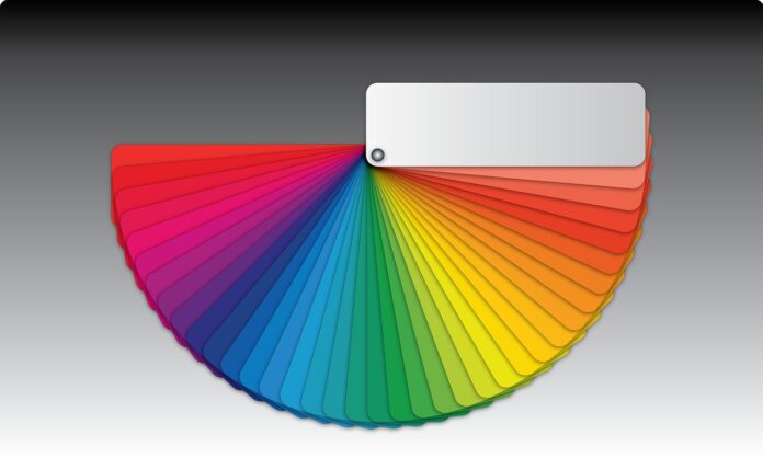
Finally, you are ready to start sketching and working on the design. Now, you have to think about the colors you want to use. If you already have some that represent your business, make sure to include them. If we are talking about a smaller label, these can be more than enough.
On the contrary, if this is not the case, you have to go back to your clients and think about what they would find appealing. Do you understand why we said that it is crucial to get to know them? Yes, that information will help you make the right choice.
Once again, you have to think about their age, gender, education, and so on. For example, if teenagers make the largest portion of your customers, you can go with vibrant colors that will draw their attention. In this instance, it is the best way to ensure that your product stands out from the others. If your target audience consists of adult women, you should probably go with pastel shades that represent femininity. Finally, if we are talking about men, something simple and traditional should be good enough.
6. The logo needs to be prominent
The logo of your business is the most important aspect of the label. Due to this reason, it is crucial it holds the center position. It goes without saying that you should make any changes to the logo to match the overall design, but instead, you have to create the design around it. Your loyal customers need to be able to see that it is your product as soon as they approach the shelf.
In addition, make sure your buyers understand what the item is as soon as they see the label. For example, juice labels always include details regarding the fruit, and candy bars always depict the flavor.
7. Keep it simple
What do we mean by this after all the tips we explained? Yes, you can create an intricate design and still keep it simple. Even though your main goal is to attract shoppers, they will probably forget about your merchandise immediately if they cannot find the information they need within a few seconds.
Because of this, you have to choose the correct font carefully. Ensure that the letters are of the right size and shape, and test several of them before making the final decision. Do not, under any circumstance, overload the design. It doesn’t matter how pretty it is. If a person cannot see clearly the information they are looking for, regardless if it is the logo, description, or something, you can rest assured that they won’t waste time investigating the label. Do you know what they will do? They will return it to the shelf and grab the one next to it.


